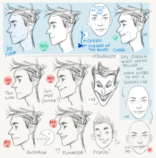
Just a quick thing I put together. This blew my fucking MIND when my anatomy teacher pointed it out. My drawings instantly got better. You might know it (good for you, I wish I knew it before too T_T) or you might not and it might help you get better.
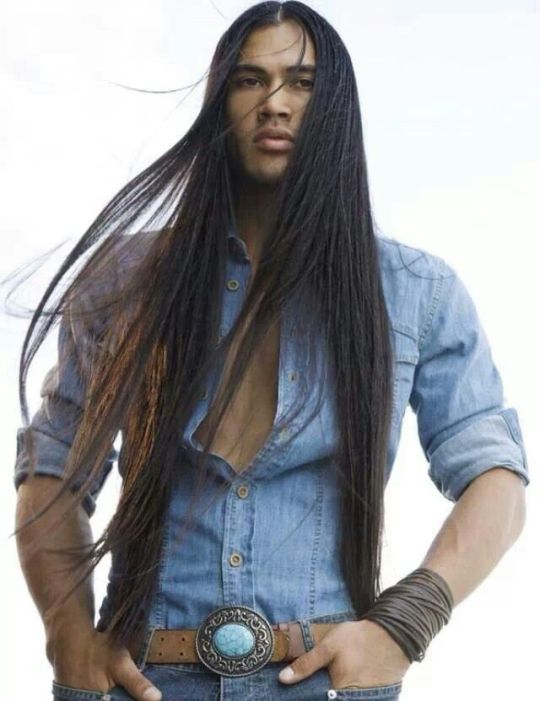
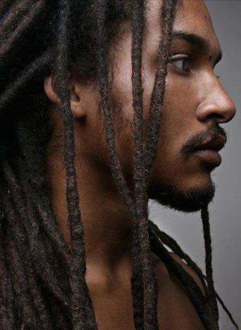
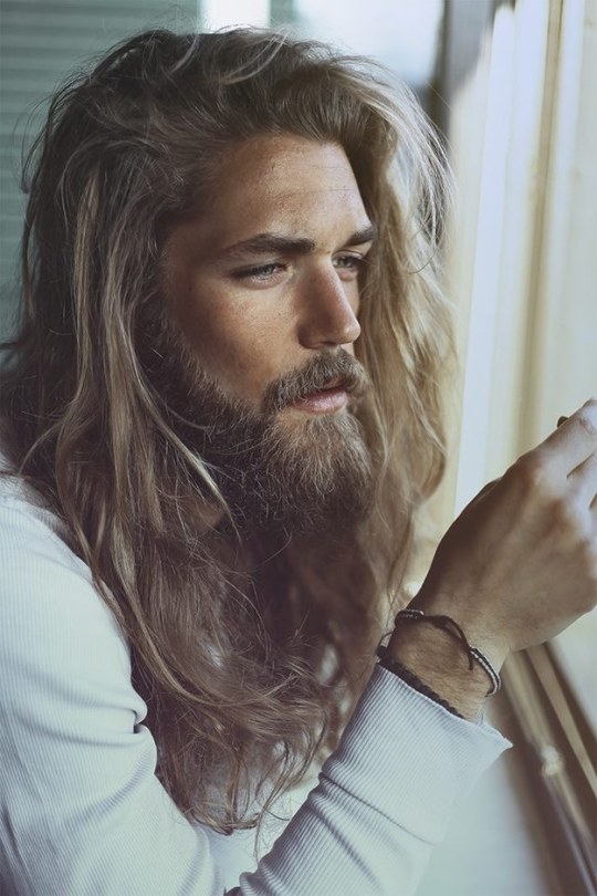
&as long as you’re not disrespecting a culture with the way you do it
you keep on doing you
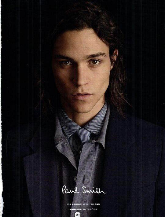
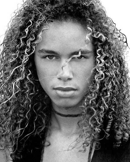
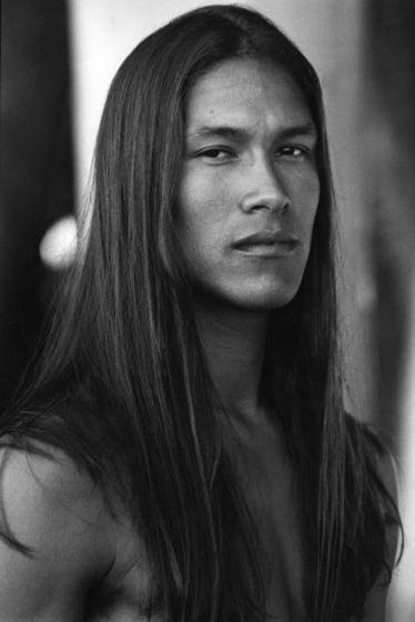
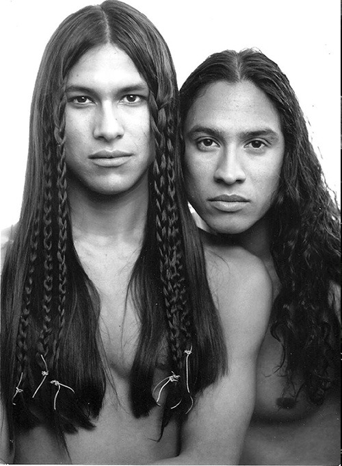
Its like someone looked into my brain and decided to make a photo set based on men I would find so overwhelmingly attractive I couldn’t look directly at them if I met them in person
The dos and don’ts of designing for accessibility are general guidelines, best design practices for making services accessible in government. Currently, there are six different posters in the series that cater to users from these areas: low vision, D/deaf and hard of hearing, dyslexia, motor disabilities, users on the autistic spectrum and users of screen readers.
[…] Another aim of the posters is that they’re meant to be general guidance as opposed to being overly prescriptive. Using bright contrast was advised for some (such as those with low vision) although some users on the autistic spectrum would prefer differently. Where advice seems contradictory, it’s always worth testing your designs with users to find the right balance, making compromises that best suit the users’ needs.
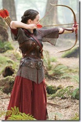
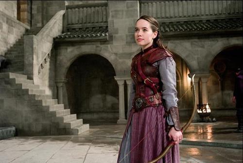
can we take a second to ponder on the fact that a kids movie did lady armor better than the entire film and comic industry
guess who i’m talking about
did you guess? Well you’re fucking WRONG because it’s Susan goddamn Pevensie
They gave her light armor, appropriate for a small archer:chainmail, an arm brace, chest plate, and a light skirt she can easily run around murderizing dudes in the face in
her hair is also only loose in the promo pictures because Susan is fucking busy not dying because her hair was flying into her eyeballs so she braids that shit back
her mail shirt is also loose enough that it doesn’t impede her arm movements it’s almost like she’s dressed for a fight wow
I like the pinks and purples under her bitchin as hell leather armor here, because you don’t have to be masculine to shoot someone in the goddamn face











 old tumblr